Very Peri
Photo courtesy Julia Wade Photography
Very Peri (PANTONE 17-3938) is a soft and moody shade of bluish-purple (read: periwinkle) that evokes creativity and contemplativeness, which is seemingly a nod to our collective ability to leave behind the past few years and start 2022 with new ideas, energy, and opportunities.
A Brand New Color
Photo courtesy Flora Bloom Photography
Very Peri marks the first time Pantone has created a brand new color for their Color of the Year series—perhaps a hint towards a fresh start.
Pantone Color of the Year
Photo courtesy Kelly Hornberger
In the events industry, the Pantone Color of the Year is instantly added to mood boards, lookbooks, styled shoots, fashion runways, stationery suites, and any place that sports a splash of color.
Sweet Idea
Photo courtesy Amy Kolo
Add a pop of color to desserts.
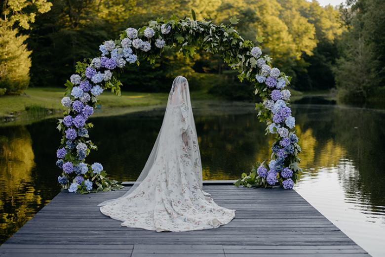
Bold Statement
Photo courtesy Cat Galetti
Using the color for a larger installation, whether a photo booth backdrop, ceiling installation, or entryway decor is a great way to make a bold statement.
Match it Up
Photo courtesy Classic Photographers
Here the groom's shoes and the bride's hair match with the color of the year.
Ring in the New Year
Photo courtesy Classic Photographers
Panton'es Color of the Year can always add a pop of color to an engagement ring.
Take the Cake
Photo courtesy Flora Bloom Photography
Very Peri elevates a traditional white cake.
Pop of Color
Photo courtesy Flora Bloom Photography
Very Peri can bring a pop of color against more neutral tones.
A Versatile Color
Photo courtesy Flora Bloom Photography
Very Peri can easily be used during any season paired with the right color palette.
Pretty in Purple
Photo courtesy Mike B Photography
Since Very Peri is a blend of both blue and purple, you can play up the purple aspect in your centerpieces as long as those will be the star of the tables and you're not competing with other bold colors or patterns.
Subtle Addition
Photo courtesy Flora Bloom Photography
Use pops of Very Peri in florals or stationery for subtle ways to add the color.
Beautiful Bouquet
Photo courtesy Hoopes Events + Baylie Ranae Photography
The easiest place to add color to your wedding is your bouquet. Rather than going with classic colors, add hues of purply blue flowers: ocean song roses, purple lisianthus, misty blue Limonium paired with your favorite white garden roses.
Dress the Part
Photo courtesy Flora Bloom Photography
If you like the idea of going bold, we recommend having wedding attire in Very Peri and making it more of a primary color in your wedding florals and decor!
Dressed to Impress
Photo courtesy Square Eye Photo
The groom's attire can also incorporate Very Peri.
Dressed Up
Photo courtesy Hoopes Events + Jordan Bree Photography
The mother of the bride can even be on trend in 2022!
Lights, Camera, Action!
Photo courtesy Hoopes Events + Angela Howard Photography
Very Peri's unique blend of blue and purple can add a unique and dramatic look through the use of lighting.
Subtle Stationary
Photo courtesy Julia Wade Photography
Add florals to stationery for subtle ways to add the color.