‘Tis the season for yuletide carols, ugly holiday sweaters, spiked eggnog, and eagerly anticipating Pantone’s Color of the Year announcement. When the much-awaited news breaks, it might feel like you’re bombarded by blog posts, news articles, and social media images that are hurriedly telling you how to use it in the following year.
In the events industry, the color is instantly added to mood boards, lookbooks, styled shoots, fashion runways, stationery suites, and any place that sports a splash of color.
Well, the time has come and Pantone has made it official: Very Peri is the new black in 2022.
As we come off the heels of 2021’s often-disputed dual Colors of the Year, Illuminating and Ultimate Grey, the general consensus on Very Peri is positive in the events industry.
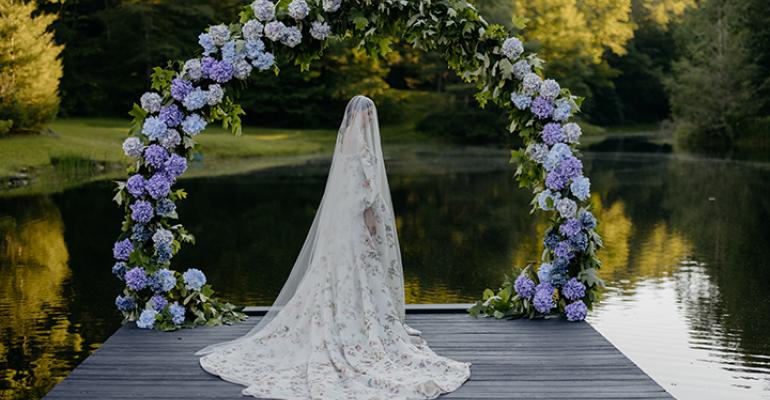
Very Peri (PANTONE 17-3938) is a soft and moody shade of bluish-purple (read: periwinkle) that evokes creativity and contemplativeness, which is seemingly a nod to our collective ability to leave behind the past few years and start 2022 with new ideas, energy, and opportunities.
Interestingly enough, this also marks the first time Pantone has created a brand new color for their Color of the Year series—perhaps another hint toward a fresh start.
It’s a nice sentiment, but how does it fit into event design? While the current wedding boom means most of 2022’s events have designs set in place, expect to start seeing more of Very Peri in the latter half of the year and into 2023 as it’s embraced by couples currently in the early stages of their planning journey.
Let’s see how industry professionals see Very Peri playing out in the next several years.
Renée Sabo, Owner of Urban Soirée
“I love this year's Pantone Color of the Year! It feels tranquil, soft and while it is a cool tone, it feels approachable and welcoming. In the wedding industry, we can definitely see couples leaning into Very Peri as the main color for their weddings, especially our spring and summer clients. We suggest pops of it in florals or stationery for subtle ways to add the color. If you like the idea of going bold, we recommend having wedding attire in Very Peri and making it more of a primary color in your wedding florals and decor!”
Joan Wyndrum, Vice President of Blooms by the Box
“Periwinkle is an infrequent color, but we certainly have many flowers that sit on the color wheel with shades of lavender, purple, and a few blue, like irises. There are so many ways you can have fun with this color. Of course, the easiest place to add color to your wedding is your bouquet. Rather than going with classic colors, add hues of purply blue flowers: ocean song roses, purple lisianthus, misty blue Limonium paired with your favorite white garden roses. Have fun with it by matching your flowers with the groom's bowtie.”
Sarah Blessinger, Owner of Kindred Weddings and Events
“What a breath of fresh air to have a fun and grounded pick for Color of the Year. Last year's colors of grey and yellow skewed toward a very rustic summer wedding. Very Peri has a fun, whimsical air about it, and I instantly was drawn to its playful nature. This year's color could be a hit with clients due to its versatility and ability to mix with established color palette favorites. Very Peri can easily be used during any season paired with the right color palette. This color can be used boldly with neutrals to stand out, in tandem with other pastels for a cohesive blend, or with jewel tones to create contrast.”
Leah Weinberg, Owner of Color Pop Events
“If you have clients who like to be on top of the latest trends, then you'll for sure be seeing more purple pop up. While I don't advocate for all-purple tablecloths at your wedding, bringing in pops with your napkins against a white linen can be a nice touch. You could also go heavy on the purple in your centerpieces as long as those will be the star of the tables and you're not competing with other bold colors or patterns. Using the color for a larger installation, whether a photo booth backdrop, ceiling installation, or entryway decor is a great way to make a bold statement.”
Tonya Hoopes, Owner of Hoopes Events
“I feel it is a confident yet soft color that can work well with base colors such as white, cream, and silver. It is a color that could be used as a replacement for the more traditional pink or blush color, creating a different spin on a traditional wedding look. Being that it has been created, I believe it sets the tone for planners, florists, and decor teams to be more creative, thinking boldly and outside the box. Very Peri would be a beautiful color for your wedding party, along with tones of navy blue, grey, or black.”
The positive sentiments for Very Peri are a good sign that the shade will influence event design over the next several years, and possibly become an industry mainstay alongside its cousin blush (hello, Rose Quartz). Regardless, expect clients to request Very Peri and other purple and blue hues and start preparing accordingly!


